



McLaren F1 launches brand new logo
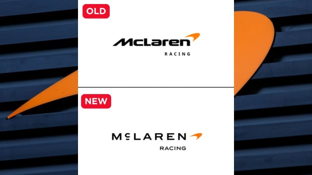
Notice any difference?

McLaren have changed their logo which will be rolled out across automotive and racing teams, but you may do well to spot it.
This isn't a case of the infamous (but mythical) change of the Japanese flag in 1999, there is a noticeable change compared to the previous version.
It's simply that along with a font change the 'c' in McLaren now has a line underneath it, and it will feature across McLaren's racing teams in F1, the World Endurance Championship (WEC) and Indy Car.
The reason for that is a nod to the past, a very distant past. It's taken from a signboard from the family of Bruce McLaren, who founded the team, and their workshop in Auckland, New Zealand owned by his parents Les and Ruth.
It was the workshop where Bruce built his first car that would give him his first racing win.
READ MORE: Red Bull announce driver change for Azerbaijan Grand Prix'
McLaren's evolved identity
In a team statement, McLaren Racing chief marketing officer, Lou McEwen said: “McLaren has evolved enormously over the years, but looking back through our shared history across Racing and Automotive, it’s poignant how much of Bruce’s original vision and spirit still runs through the business today.
“This evolved identity perfectly bridges that proud heritage with our future ambition.
“It celebrates the symbols and stories our fans, partners and team mates already know and love, while giving us a more connected expression of where we’re heading next. It feels unmistakeably McLaren.”
Chief creative officer of McLaren Automotive, David Woodhouse added: “There is something uniquely special about McLaren.
“Throughout our history, we’ve never been content to follow established paths.
“We’ve always looked ahead, driven by a restless desire to innovate, create and push beyond expectations.
“This evolution of our visual identity captures that spirit. It’s a reflection of the journey we are on as a company.
“It marks the beginning of a new chapter for McLaren, giving a physical expression to the ambition, creativity and forward momentum that is shaping our future.”
When did McLaren return to papaya colours?
McLaren's latest nod to its past follows its decision to revert to a papaya colour scheme back in 2017. From 1974, the team changed its colours from the original papaya colour to red and white to fit with its main sponsor Marlboro in an iconic partnership that lasted until the end of 1996.
After West tobacco started sponsoring them in 1997, McLaren under the control of Ron Dennis were the ultimate corporate team in the paddock, with a mainly black and silver or chrome with red trim with various sponsors that would last right through to Dennis leaving the company at the end of 2016.
McLaren's original papaya colours returned for 2017 and aside from one-off special livery changes has remained in some capacity ever since including last season where they won both F1 titles for the first time since 1998, with Lando Norris world champion.
F1 2027 GRID: Seven seats still open and one massive question mark
READ MORE: Christian Horner 'perfect man' to fix Ferrari as F1 star highlights Vasseur's 'big mistake'
Related
More F1 news
Latest F1 news
Recommended by the editors
 Azerbaijan Grand Prix
F1 Odds: Azerbaijan Grand Prix favourites and the grim reality for Lewis Hamilton and Ferrari
 F1 Analysis
F1 cannot stop punching itself in the face and shorter races are the knockout blow
 Azerbaijan Grand Prix
F1 Azerbaijan Grand Prix schedule and times as race moved forward
 F1 2027
F1 2027 Grid with seven seats still open and one massive question mark







Races
-
 Grand Prix of Australia 2026
-
 Grand Prix of China 2026
-
 Grand Prix of Japan 2026
-
 Saudi Arabian Grand Prix 2026
-
 Miami Grand Prix 2026
-
 Grand Prix du Canada 2026
-
 Grand Prix De Monaco 2026
-
 Gran Premio de Barcelona-Catalunya 2026
-
 Grand Prix of Austria 2026
-
 Grand Prix of Great Britain 2026
-
 Grand Prix of Belgium 2026
-
 Grand Prix of Hungary 2026
-
 Dutch Grand Prix 2026
-
 Grand Prix of Italy 2026
-
Gran Premio de España 2026
-
 Grand Prix of Azerbaijan 2026
-
 Grand Prix of Bahrain 2026
-
 Grand Prix of Singapore 2026
-
Grand Prix of the United States 2026
-
 Gran Premio de la Ciudad de Mexico 2026
-
 Grande Prêmio de São Paulo 2026
-
Las Vegas Grand Prix 2026
-
 Qatar Grand Prix 2026
-
 Grand Prix of Abu Dhabi 2026
Follow us on your favorite social media channel
Editorial & corporate information

Avenue HQ
10–12 East Parade
Leeds
LS1 2BH
United Kingdom Regional correspondence
View contact page