


F1 2021 launch liveries ranked
The lookers and those you should look away from on 2021 grid
Formula 1 launch season is almost over with all 10 teams revealing their new looks for the coming year.
Although only nine cars have been launched - with Haas yet to reveal the VF-21 - all 10 liveries have now been unveiled. It is safe to say some certainly look better than others.
To rank the new liveries, the GPFans Global team of chief editor Ian Parkes, deputy editor Sam Hall and F1 writer Ewan Gale each gave their personal ranking from one to 10, using the F1 points system of 25 for first and one for 10th to create a definitive list.
Remember to let us know in the comments which designs are your favourites and if you agree with our combined rankings.
10. Williams - 3pts
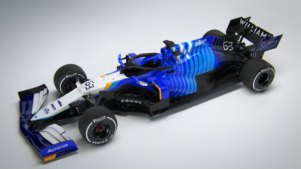
There was only one team where the ranking was unanimously agreed upon and that was Williams. The livery supposedly harks back to the 1992 championship-winning livery of Nigel Mansell but instead looks a bit of a mess.
More sponsors are incoming which may improve the overall look but, for now at least, the FW43B is rooted to the foot of the table.
9. Ferrari - 10pts
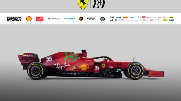
The final livery to be launched and sadly, this failed to hit the mark. After the simply stunning design to commemorate the Scuderia's 1000th Grand Prix at Mugello last year, we had high hopes, but alas.
The throwbacks to that design with the 'hand-painted' numbers and the fade to burgundy at the rear probably sounded good in a pitch meeting but the reality was different.
Add in the bizarre choice of a green Mission Winnow logo and it is an amalgamation of ideas that failed to work for us.
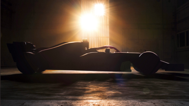
8. Haas - 12pts
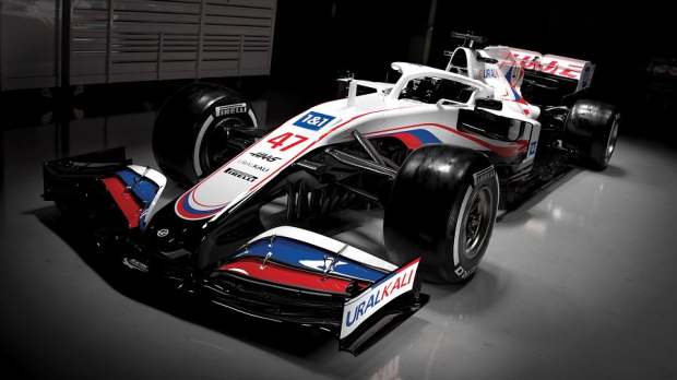
The most controversial launch livery and one which is under investigation by the World Anti-Doping Agency for carrying the Russian flag - something that is illegal in FIA competition at present.
Haas deny the layering of colours in the same order as the Russian flag is anything more than a coincidence, instead claiming it represents the recently revamped logo of title sponsor Uralkali that previously sported red and green.
Controversy aside, however, there have been far worse looks than this one.
7. McLaren - 20pts
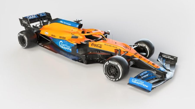
When McLaren launched the MCL35M, it did not take long for fans to pick up on the fact that its livery was almost identical to that of its predecessor.
Whilst this is not a bad thing, the general opinion within GPFans Global was that it had actually been made slightly worse.
Yes, the papaya orange is distinctive on the grid and to cameras, but the look lacked imagination, with only one vote putting McLaren inside the top five.
6. Mercedes - 24pts
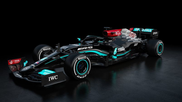
Mercedes' second black livery is likely to be one that splits opinion, and this was illustrated by us, with two declaring it the seventh-best look, and one placing it fourth.
The Mercedes three-pointed stars last year were a busy but subtle touch to the rear of the car, but the decision to plaster AMG logos across the rear is a key factor as to why the team sits in the bottom half of this ranking.
Perhaps out on the track, rather than under studio lights this look may grow on us!
Related
More F1 news
Latest F1 news

Recommended by the editors
 F1 2026
Is Martin Brundle a hypocrite for F1 criticism?
 Latest F1 News
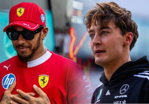
Lewis Hamilton dealt George Russell 'massive hit' to F1 title hopes
 Hungarian Grand Prix
F1 drivers to hold talks with FIA at Hungarian Grand Prix
 Hungarian Grand Prix
Honda announce Aston Martin boost for Hungary ahead of F1 summer break upgrades


Races
-
 Grand Prix of Australia 2026
-
 Grand Prix of China 2026
-
 Grand Prix of Japan 2026
-
 Grand Prix of Bahrain 2026
-
 Saudi Arabian Grand Prix 2026
-
 Miami Grand Prix 2026
-
 Grand Prix du Canada 2026
-
 Grand Prix De Monaco 2026
-
 Gran Premio de Barcelona-Catalunya 2026
-
 Grand Prix of Austria 2026
-
 Grand Prix of Great Britain 2026
-
 Grand Prix of Belgium 2026
-
 Grand Prix of Hungary 2026
-
 Dutch Grand Prix 2026
-
 Grand Prix of Italy 2026
-
Gran Premio de España 2026
-
 Grand Prix of Azerbaijan 2026
-
 Grand Prix of Singapore 2026
-
Grand Prix of the United States 2026
-
 Gran Premio de la Ciudad de Mexico 2026
-
 Grande Prêmio de São Paulo 2026
-
Las Vegas Grand Prix 2026
-
 Qatar Grand Prix 2026
-
 Grand Prix of Abu Dhabi 2026
Follow us on your favorite social media channel
Editorial & corporate information
Avenue HQ
10–12 East Parade
Leeds
LS1 2BH
United Kingdom Regional correspondence
View contact page