


F1's 2019 liveries ranked!
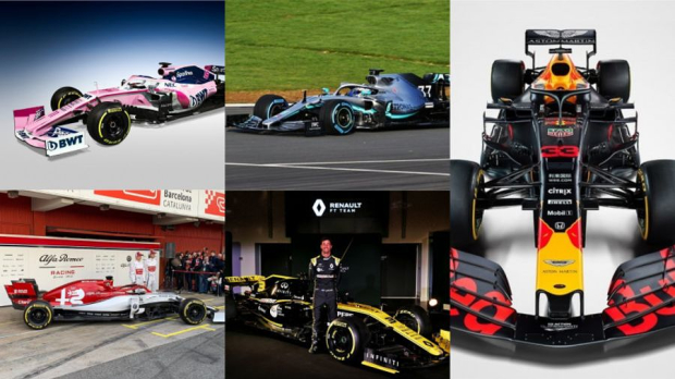
With the first morning of preseason testing has also come our look at every Formula 1 car for the year to come. There have been a few radical changes, but plenty more tweaks to previous designs. Craig Norman took a look at the paint jobs and ranked them worst to best.10. Haas
Bear with me here...
In the 1996 movie Multiplicity, Michael Keaton plays a construction worker who is cloned in order for him to cover all aspects of his life. He's cloned once, then twice, then these clones copy themselves to make a copy of a copy that's nowhere near as sharp as the original.
This is the epitome of this year's Haas, if you take some artistic license and swap out “Michael Keaton” for “John Player Special Lotus”. The design is iconic but it feels diluted and borderline rehashed by Rich Energy for promotional purposes. Of course, if the 2011 Lotus hadn't happened I would, of course, be waxing lyrical about how retro and cool it is. But it did happen, and this feels, quite frankly, a bit cheap.
I want to like it, but I've liked it before, liked it again and am now well aware that it's a cynical ploy to pull on my heartstrings. No thanks.
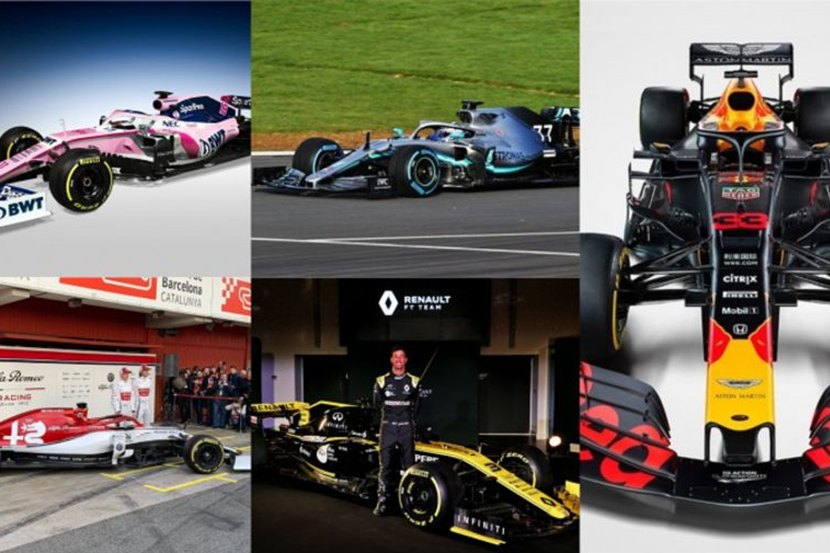
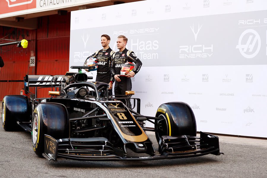
9. Williams
New beginnings for Williams means a new set of colours, a return of the classic white and blue, but with lighter shading. With Formula E growing in popularity it's almost like Williams are taking cues from that series - the team gear of dark blue with electric trim feels modern, and the bright blue haze on the chassis pops at certain angles.
However they have gone down the route of last season by blanketing most of the side of the car in black, meaning what's left is a bit awkward in execution. New sponsor Rokit looks clunky and feels like a last minute addition. And, if you squint ever so slightly, it still kind of looks like the alcohol free Martini livery the team ran in Abu Dhabi.
8. Alfa Romeo
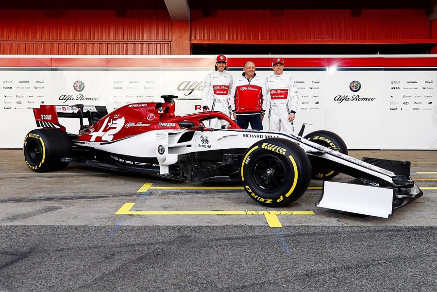
More of the same from the newly named Alfa Romeo team as their homage to Sauber is to copy the Swiss team's last livery in F1.
The burgundy engine cover is the highlight here as the Alfa badge has been offset to give it a bit more edge. It would be nice if the colouring would continue down the car along the top of the cockpit and onto the nose, within the blue lines, as front on it still looks a bit, well, Sauber-y.
The lack of sponsors on the front wing, including the end plates, suggests there's more to come however. Points have been deducted for having Stelvio and Giulia across the race suits to confuse casual viewers of just who Kimi Raikkonen and Antonio Giovinazzi actually are.
7. Racing Point
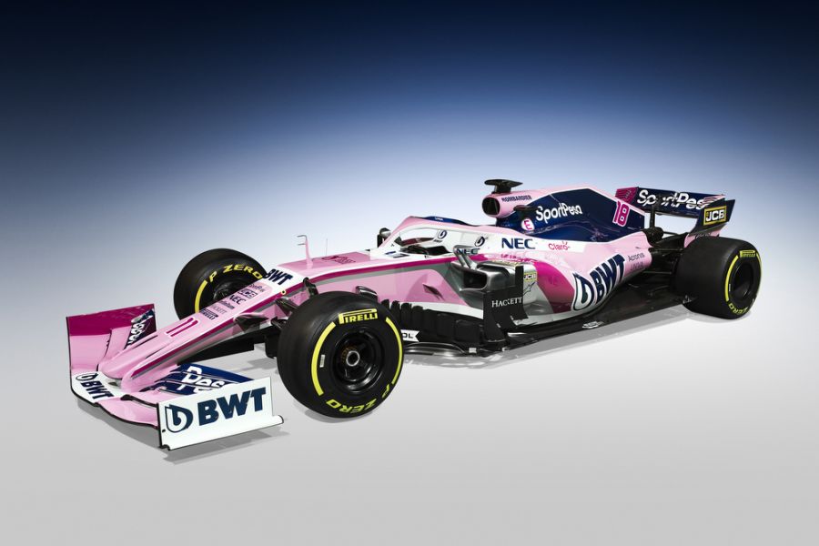
There were fears we may suffer the disappearance of the pink-and-white once the Force India name disappeared from F1. Thankfully Racing Point have kept it in their inaugural season in the sport, and have made a few changes to make it their own.
The dark blue added by Sport Pesa is a bit out of place and brings the whole package down a shade in terms of darkness. It doesn't feel as fun to be honest, and almost makes it look like a box of marshmallows with an Everton shirt draped over it at a funny angle. There's a flash of chrome on the sidepods that does the same - darken the tone, not add any other football references - but there's hope here.
The BWT logos are the same shade of Sport Pesa blue and everything together does work. The team has a habit of making little changes here and there as seasons progress, so this might not even be what we end up in Abu Dhabi with.
5=. Toro Rosso
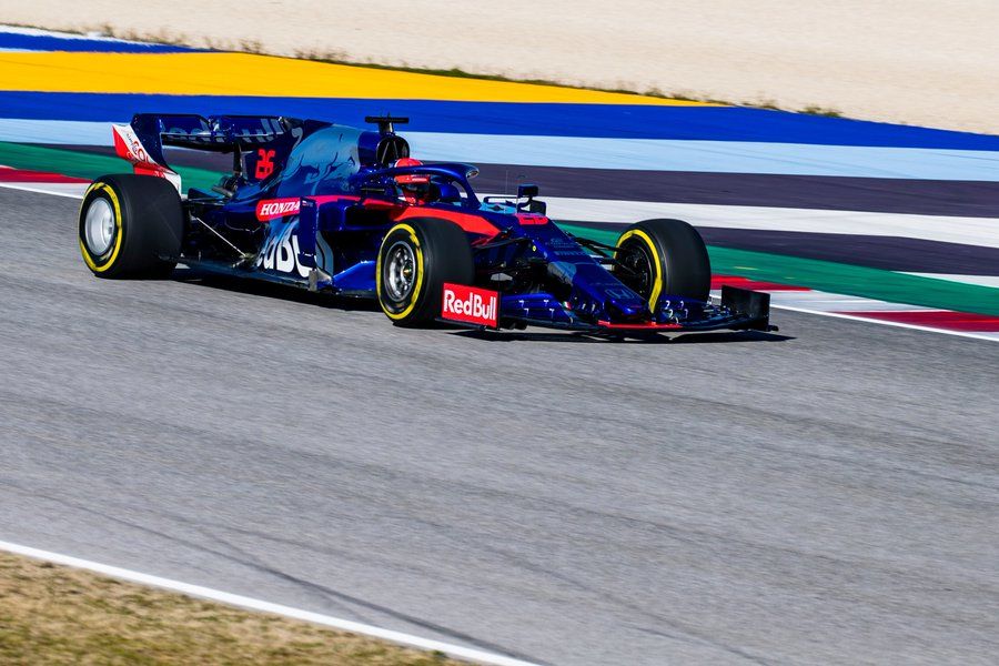
Clean and crisp as it has been in previous seasons, Toro Rosso's scheme still feels as fresh as its 2017 debut. It's easy to forget that the team ran a burnished version of the Red Bull classic livery for 10 years as this new blue, red and silver combination is easily recognisable and hasn't lost its edge yet. If I was 12 years old again this would be on a poster on my wall.
5=. Renault
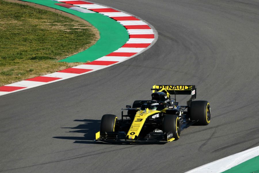
You'd be fooled into thinking that Renault haven't changed their livery for 2019 but you'd be wrong - subtle tweaks such as a brighter shade of yellow, black numbers and sharper lines bring it further along than last year's.
It's more of a poisonous frog than a racing car and that's not necessarily a bad thing.
It still retains its excellent ability to be essentially two cars in one. From the side it's predominantly black with a hint of yellow, and from the front it's aggressively yellow and ready for combat. Is it a black car or a yellow car? It's all about perception. It's been a few seasons of evolution since 2016 but the identity of Renault is now firmly established.
4. McLaren
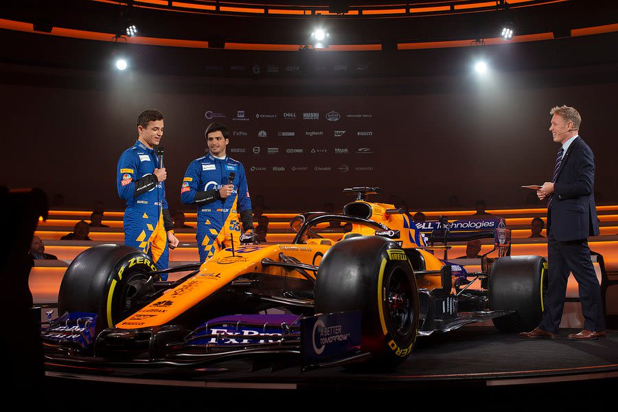
Last year was the big one for McLaren as a brand. Papaya was back and so, as we were led to believe, were the good times. A 1960s livery on a 2018 car looked great to start with but then just got a bit bland as the season didn't live up to promise and McLaren retreated to lick their wounds in the winter.
In that time there's been a bit of a youthful revolution. The fresh new faces of Carlos Sainz and Lando Norris, plus the team's increasing involvement in the eSport movement, has produced this papaya/blue hybrid that's almost futuristic in its execution, especially with the patterned design on the engine cover.
It's papaya where it needs to be and black everywhere else - the halo and bulbous nose are coloured to take eyes off of them, while the high black line from the base means the white sponsor logos are at an angle and slightly different to what we're used to. The McLaren feels like there's less transition between design screen to actual car than any other team and gives it a slight edge over their rivals. It's a tidy package.
3. Mercedes
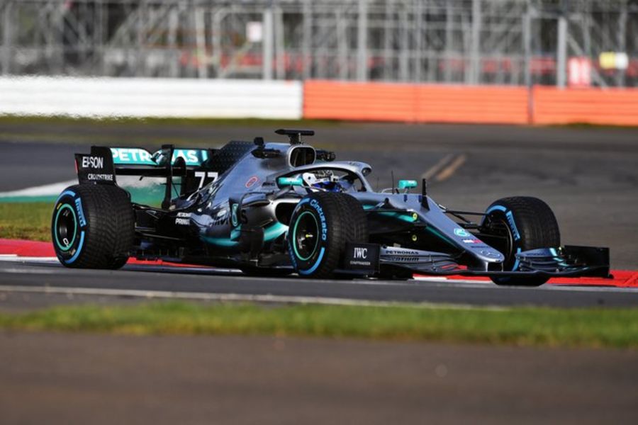
There's only so much you can do with silver and teal, as Mercedes have found out since 2010. Each and every year there's a slight tweak here, a different flash of Petronas colouring there, but the standard is the same and it's almost like the team doesn't want to upset the apple cart too much in case they break this run of imperious form – just like David Coulthard's lucky pants.
This year heralds some tweaks that move it away from the norm; there's more black at the base of the car, the numbers aren't the traditional red colouring and the engine cover has a curious fade from silver to black under a spread of three-pointed stars.
This is classy effort with a palette that's barely changed in nearly a decade, breathing new life into the German brand. The emperors have new clothes.
2. Red Bull
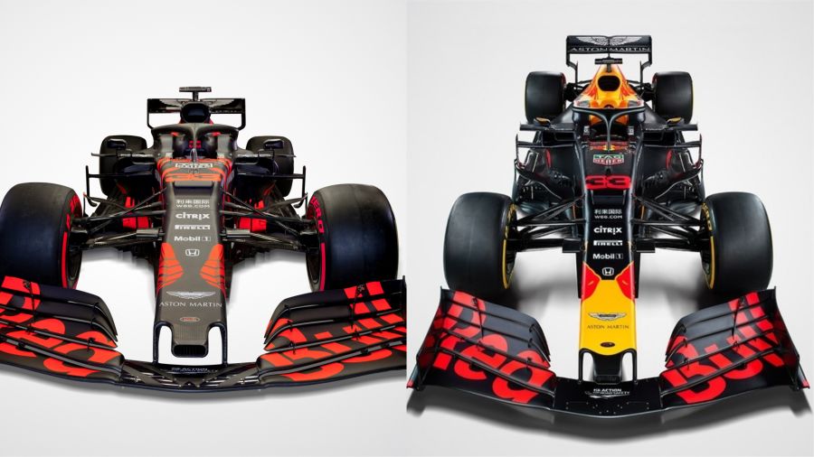
Yes, it was a one off and, yes, it's gone back to the regular matte blue as the car has hit the track in anger, but you have to hand it to Red Bull - they really know how to get eyes on their cars on launch day.
Not that the usual scheme would mean that Red Bull fall further down this list. It will eventually be considered a modern day classic by aficionados because it is; it's instantly recognisable with the yellow flashes on the nosecone the key indicator, a trend started, unbelievably, by Sauber in 1996.
But back to this angry red test livery; it's fantastic. Between this, the blue urban camo of 2018 and the zebra print of 2015, this is a team that loves to take chances with colour schemes, even if it's for a day or two. The sceptic in me would say that this attempt makes it look like one giant warning light for the Honda engine, but we're over "Honda engines go bang" jokes, aren't we?
1. Ferrari
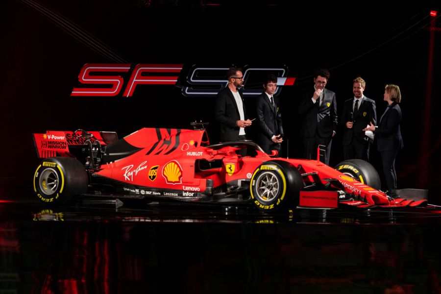
Once you get past the fact that this year's Ferrari, just like every other Ferrari before it, was nailed on to be red, you really do start to appreciate that the 2019 model of the historic Italian marque is really something special. Last season Ferrari suffered from a rushed livery that looked thrown together at the last minute thanks to losing Santander and loaning Alfa Romeo to Sauber.
This wasn't really improved once Mission Winnow was introduced late in Japan. This season looks much more organised and has produced a tidy package. The bold black cut in on the engine cover is fantastic and gives character, as does the thin Italian flag on the shark fin. All the body work is fashioned with black rivets too. It very much is the case that the devil is in the detail.
Rumours of it being matte in colour have proved true and it's something to behold. The sponsorship of Mission Winnow - less of a promotional aid and more of a subliminal message from Ferrari stakeholders - is much better suited in black. The team will hope that having that plastered on the car and overalls won't add to the pressure everyone involved with the Prancing Horse is already feeling.
MORE: Alfa Romeo reveal 2019 F1 car in Barcelona
MORE: Red Bull confirm 2019 F1 livery
Recommended by the editors
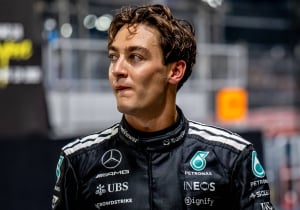 George Russell
How George Russell injured himself during Mercedes F1 celebration
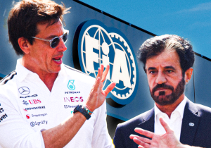 ADUO
ADUO
8 ways the FIA might have decided their F1 ADUO rankings for 2026
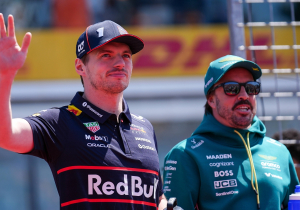 F1 News & Gossip
Fernando Alonso announces plans to become Max Verstappen's team-mate for iconic race
 Daniel Ricciardo
Daniel Ricciardo enjoys new seat in life and shares joy over grid return


Races
-
 Grand Prix of Australia 2026
-
 Grand Prix of China 2026
-
 Grand Prix of Japan 2026
-
 Grand Prix of Bahrain 2026
-
 Saudi Arabian Grand Prix 2026
-
 Miami Grand Prix 2026
-
 Grand Prix du Canada 2026
-
 Grand Prix De Monaco 2026
-
 Gran Premio de Barcelona-Catalunya 2026
-
 Grand Prix of Austria 2026
-
 Grand Prix of Great Britain 2026
-
 Grand Prix of Belgium 2026
-
 Grand Prix of Hungary 2026
-
 Dutch Grand Prix 2026
-
 Grand Prix of Italy 2026
-
Gran Premio de España 2026
-
 Grand Prix of Azerbaijan 2026
-
 Grand Prix of Singapore 2026
-
Grand Prix of the United States 2026
-
 Gran Premio de la Ciudad de Mexico 2026
-
 Grande Prêmio de São Paulo 2026
-
Las Vegas Grand Prix 2026
-
 Qatar Grand Prix 2026
-
 Grand Prix of Abu Dhabi 2026
Follow us on your favorite social media channel
Editorial & corporate information
Avenue HQ
10–12 East Parade
Leeds
LS1 2BH
United Kingdom Regional correspondence
View contact page